Robbie AI
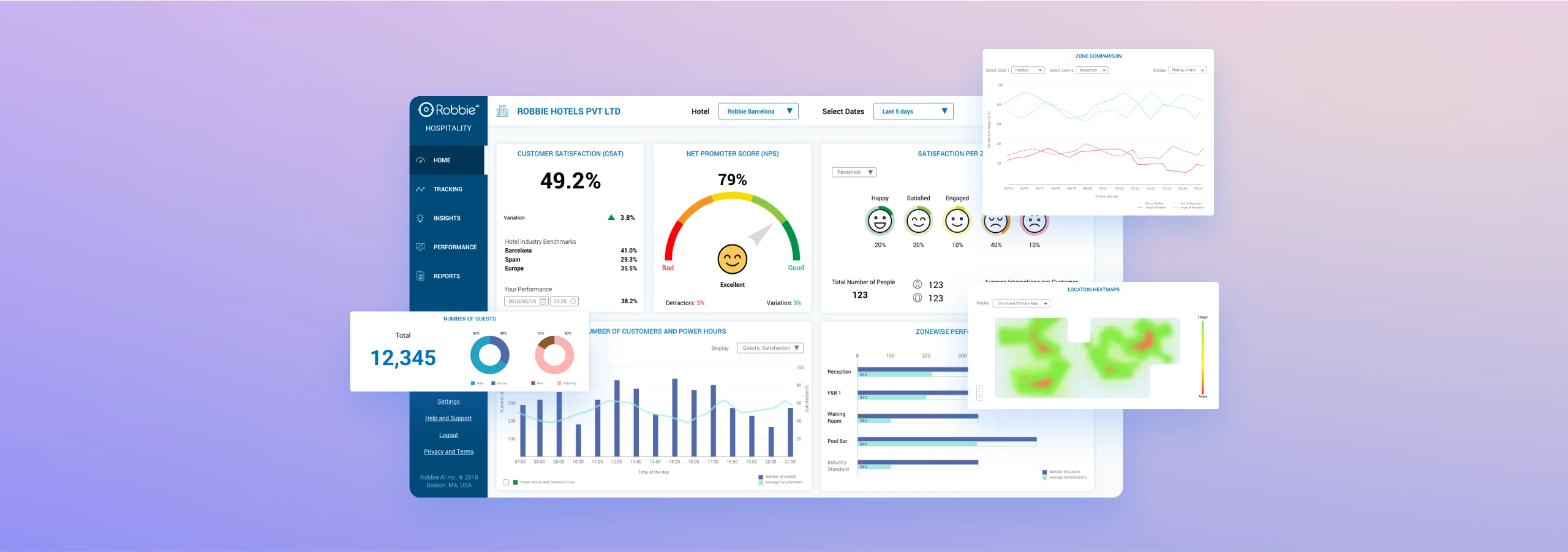
Customer satisfaction dashboard for Robbie AI
My Role
UX Designer (2018-19)
Status
Launched by RobbieAI at: https://robbie.ai
Background
RobbieAI utilizes advanced computer vision and wearable technologies to evaluate and anticipate human emotions and behavior. Its primary purpose is to help businesses monitor customer satisfaction metrics and enhance operational efficiency.
The system is designed to support businesses in analyzing emotional metrics of customers and performance data of employees, enabling informed decision-making. As a designer, my role involved drafting the architecture and product design for the Robbie Dashboard, ensuring it effectively meets the project's objectives. I worked on creating an interface that allows users to easily access and interpret complex data, providing actionable insights to improve customer interactions and operational performance.
User journey checkpoints
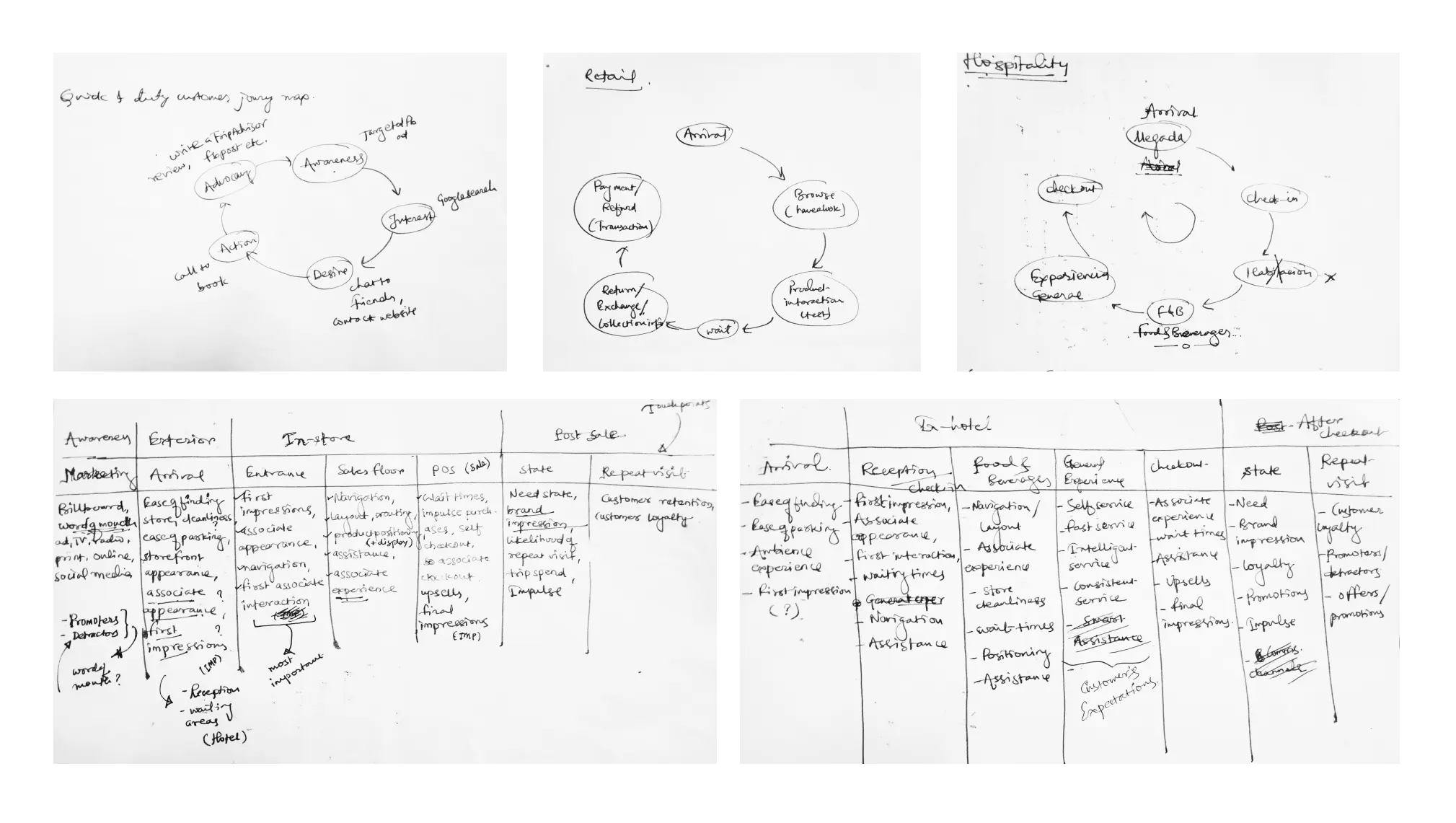
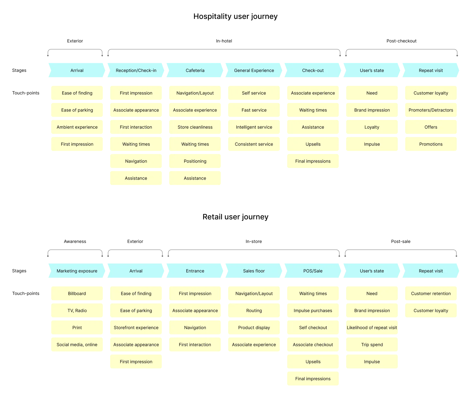
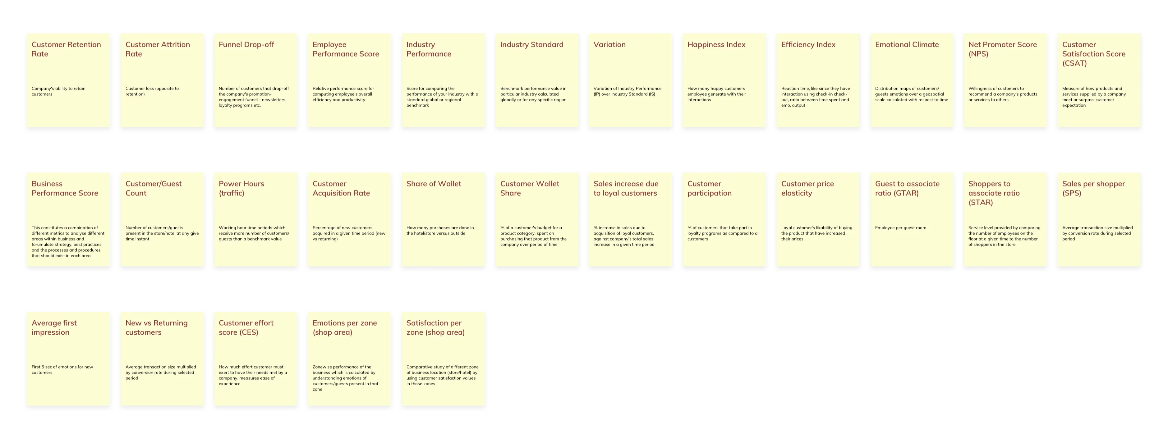
Robbie caters primarily to the Hospitality and Retail industries. In order to comprehend the essential checkpoints within these domains, we conducted an analysis to map the interaction points for users.
This mapping exercise aims to facilitate a comprehensive exploration of the customer journey and identify key performance indicators (KPIs) for the business entities involved.
Key performance indicators
In the context of RobbieAI, these KPIs are instrumental in mapping the checkpoints of the customer journey to quantifiable measures. By identifying and tracking these metrics, we can comprehensively assess and evaluate user interactions and business performance.
For example, in the Hospitality industry, KPIs might include metrics such as customer satisfaction scores, dwell time at service points, and repeat visit rates. In Retail, key metrics could encompass queue times, conversion rates, and sentiment analysis of customer feedback.
These quantifiable measurements allow businesses to identify areas for improvement and make data-driven decisions to enhance operational efficiency and customer satisfaction.
Information Architecture
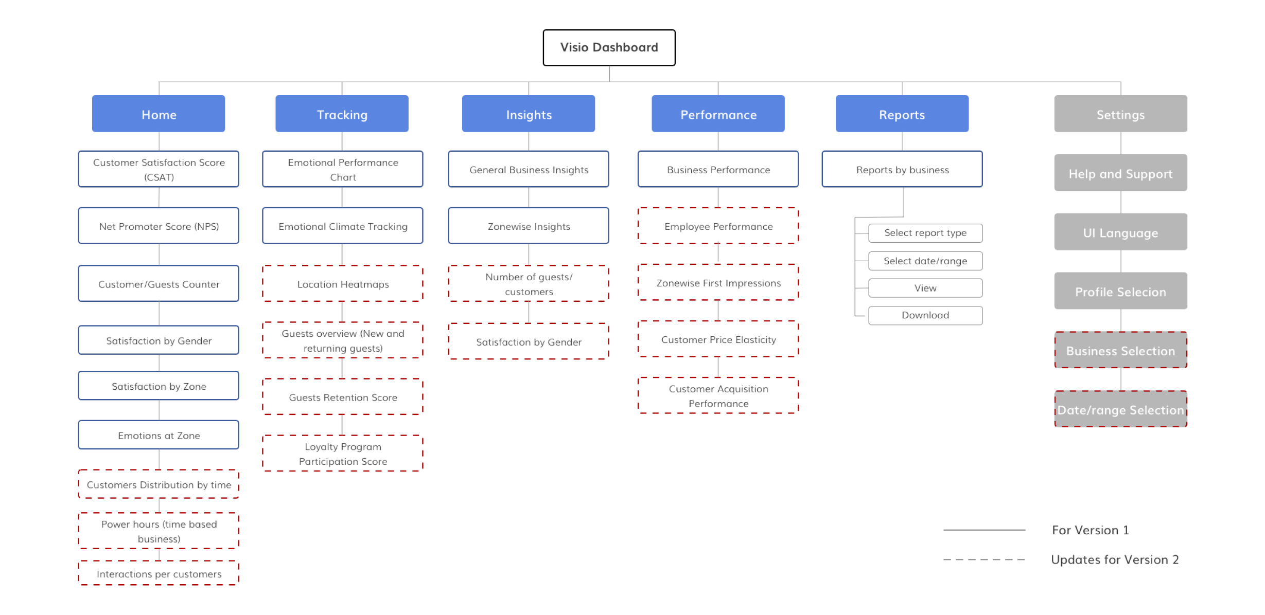
During the initial iteration, our focus was on achieving fundamental objectives by establishing a solid foundation for RobbieAI. This phase involved defining core functionalities and ensuring that the system could effectively collect and analyze basic emotional and behavioral data.
In the second iteration, we made substantial updates to the system components to incorporate enhanced features and capabilities. These updates were designed to provide more advanced analytics and better support for business decision-making in both the Hospitality and Retail industries.
The Information Architecture below provides a visual representation of the system's structure and evolution throughout both iterations
Ideation notes
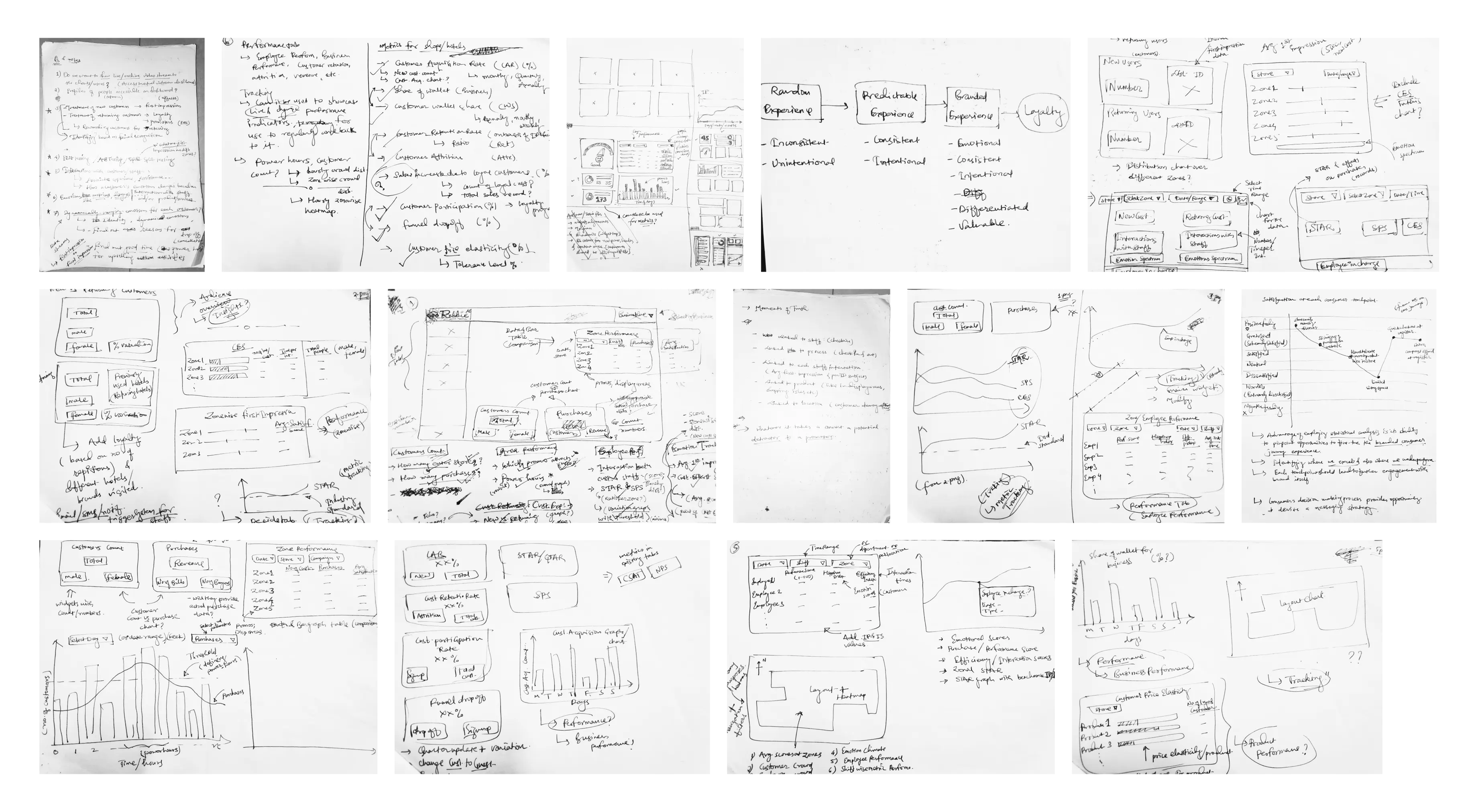
The development involved extensive ideation and consideration to ensure the system demands are met. I collaborated closely with my team and product owners to establish a clear overall vision and roadmap for the project.
During this process, we generated numerous sketches, wireframes, and concept designs that helped us refine our ideas and bring the system to life. The presented snapshot showcases a selection of these initial concepts and iterations, which were instrumental in shaping the final product.
Wireframes
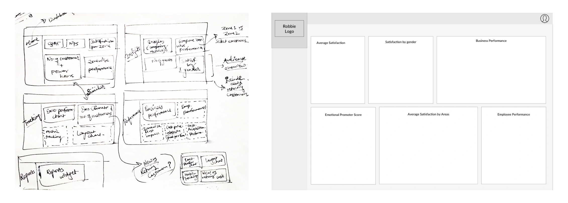
The wireframes presented below illustrate the ideation process and preliminary sketches that culminated in the final layout design for our system pages. These wireframes were instrumental in shaping the user interface of the dashboard, enabling us to conduct rapid iterations and gather invaluable feedback from stakeholders at various stages.
During the initial phase, our focus was on conceptualizing different navigation structures and information hierarchies to ensure an intuitive and efficient user experience. These early sketches served as a foundation for refining the interface, allowing us to test various layouts and identify potential usability issues before investing in more detailed prototyping. The feedback collected during these sessions was crucial in guiding subsequent iterations.
First iteration
The initial iteration of our design process was pivotal in visualizing the core components of our system, allowing us to explore the intricacies of KPI widgets, navigation structures, and customization options in depth. This exploratory phase was crucial as it provided a tangible framework within which we could analyze and refine each element.
Through ongoing evaluation and feedback from these initial iterations, we were able to identify areas for further enhancement, driving continuous improvement and innovation in our design process.
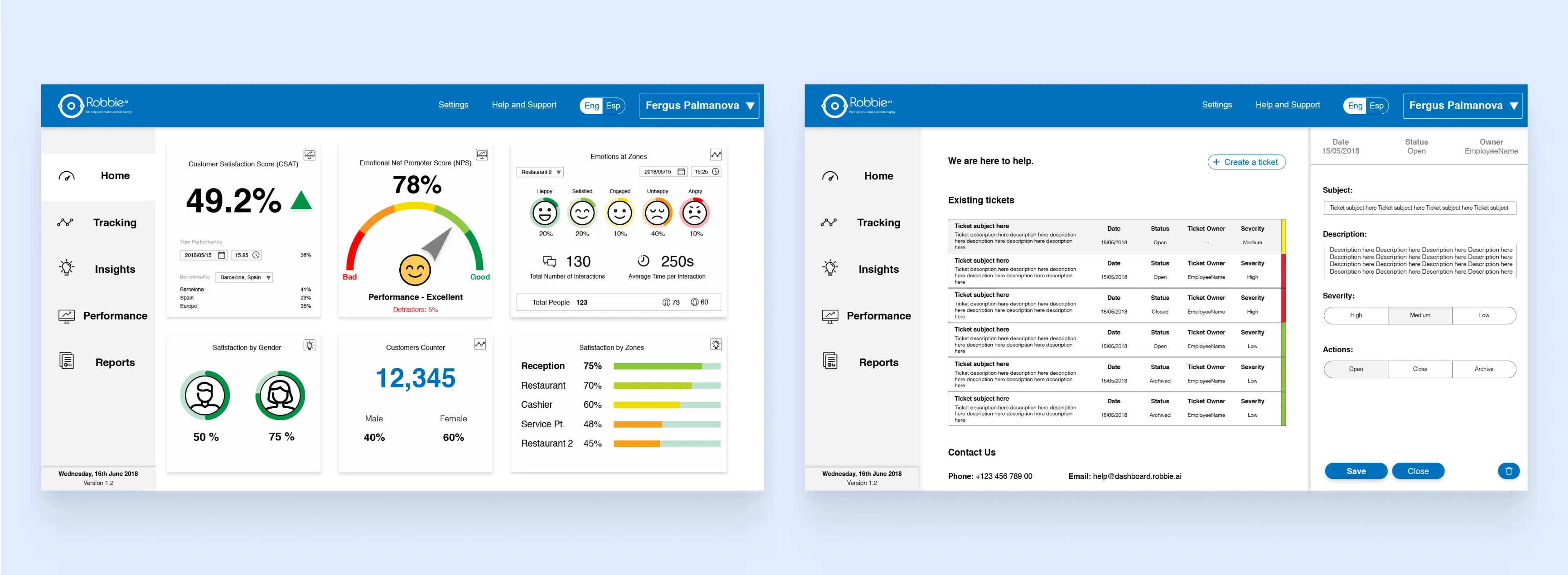
Second iteration
Based on the feedback gathered from the initial iteration, we made several enhancements to the design. These changes included the addition of new functionalities and updates to the visual design, aiming to significantly improve upon the original version. This iterative process allowed us to refine the product's features and aesthetics, ensuring a more user-friendly and visually appealing experience for our users.

KPI Widgets
The dashboard components and widgets have been designed in detail to provide valuable performance indicators for users, delivering an engaging and visually pleasing experience. Each element is crafted to ensure clarity and ease of use.
The design adheres to a modular and customizable structure, allowing for seamless updates and adjustments based on individual user needs. This flexible approach ensures that users can easily tailor the dashboard to suit their preferences, thereby optimizing their overall experience and productivity.

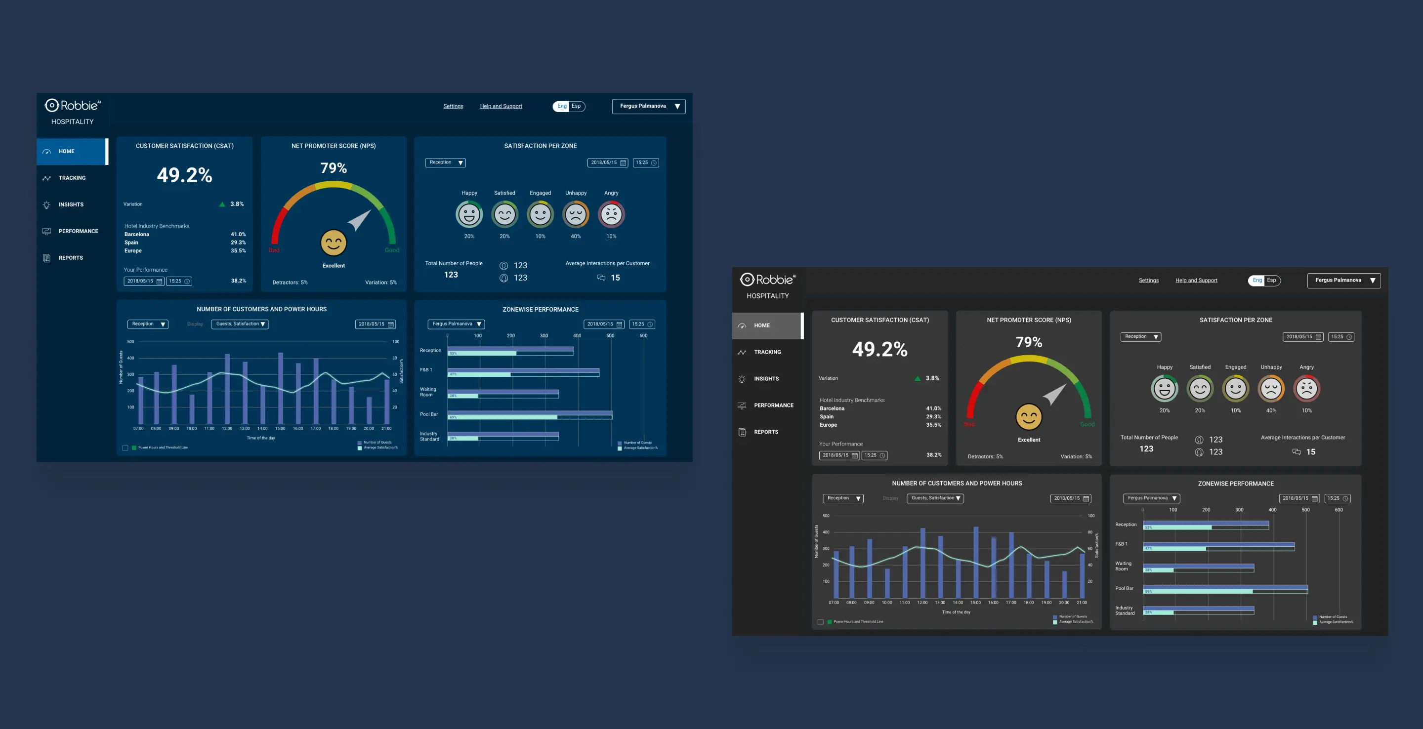
Dark visual modes
To provide users with a more comfortable and customizable interface that aligns with their preferences, we integrated darker themes into the system UI and visual design. Darker themes not only offer aesthetic appeal but also improve readability and reduce eye strain, especially during late-night or low-light conditions.
