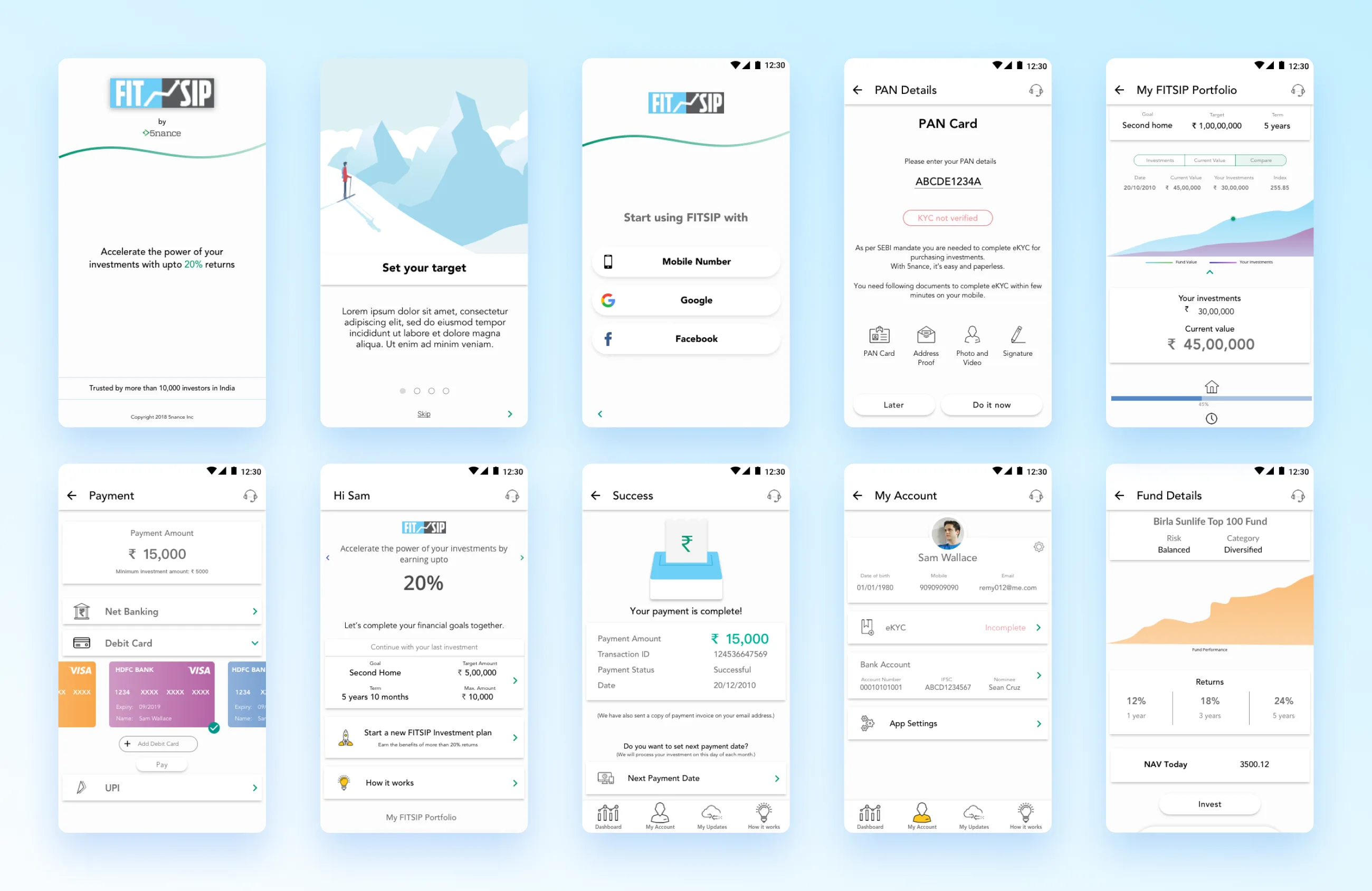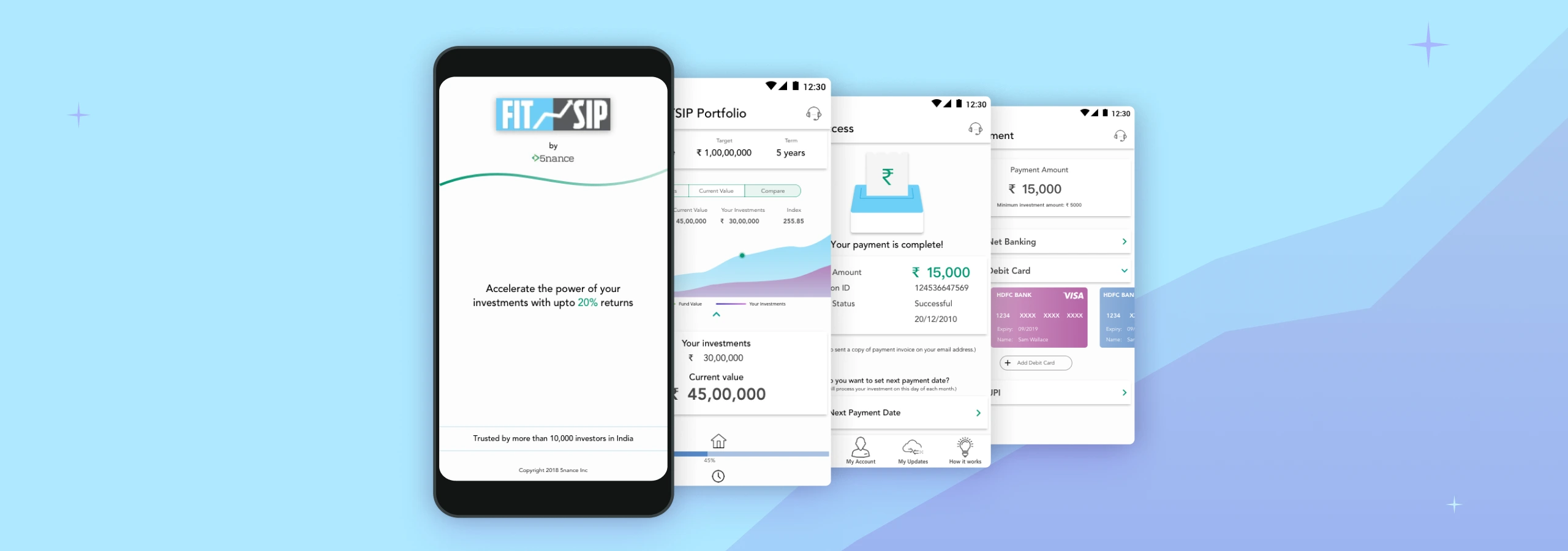
5nance
FITSIP Investment management and marketplace on mobile
My Role
UX Designer (2017-18)
Status
Project was parked by business
Background
FITSIP is an integral component of the 5nance suite of mobile applications, marking the pioneering module to be developed as a standalone mobile application. Although FITSIP was available on the mobile app store, its performance fell short of expectations, despite considerable marketing efforts.

Exploring problems
The FITSIP mobile application had encountered a varied market response and lower-than-anticipated user retention rates. To address these challenges, we conducted an in-depth analysis of different use cases and user journeys in order to identify barriers faced by users.
Initially, our focus was on understanding the onboarding process and the obstacles users encountered while using FITSIP. To gain insights, we conducted a comprehensive group walkthrough session with participants using the existing version of FITSIP.
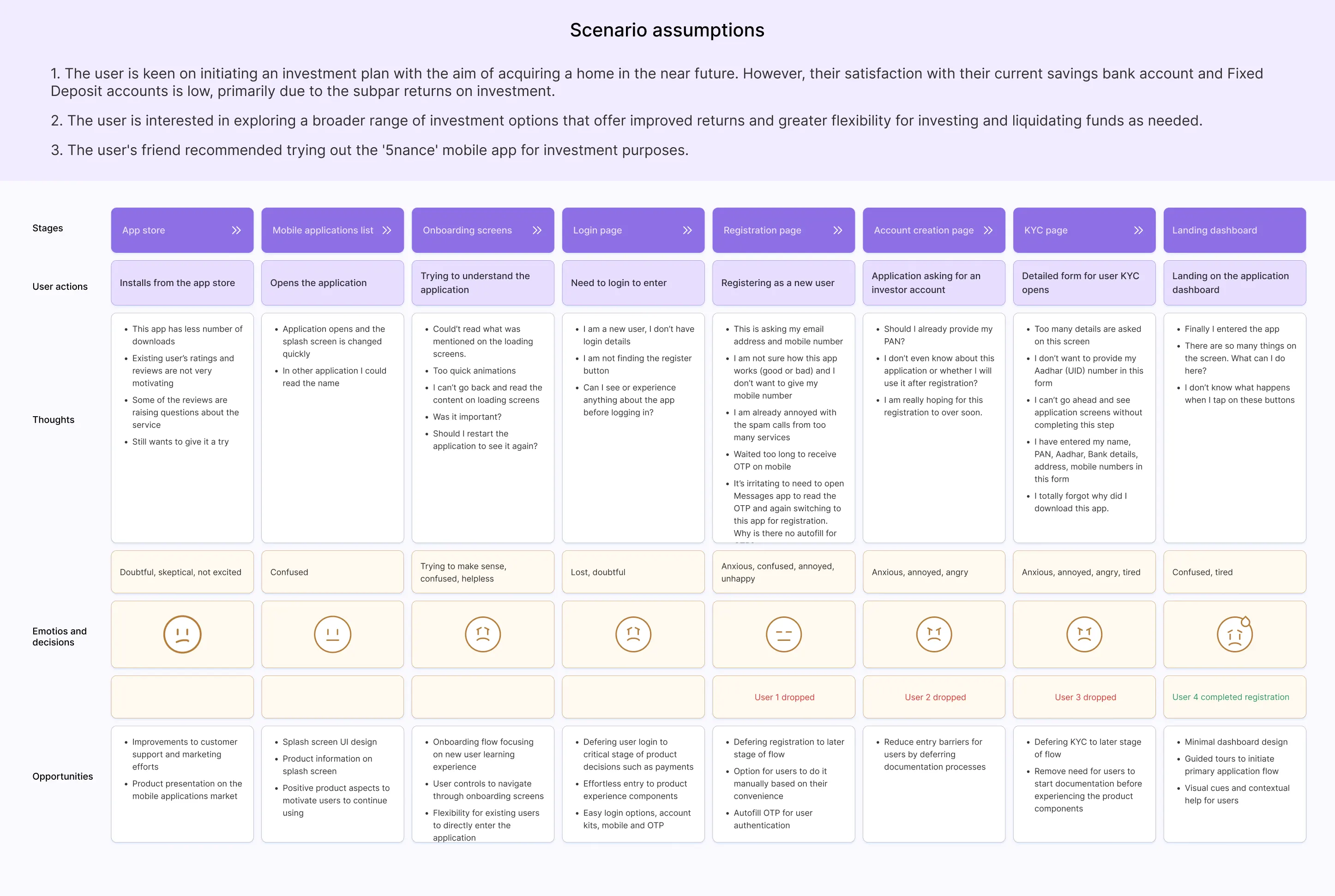
The study revealed a significant drop-off in user engagement during the onboarding stage, resulting in limited exploration of product functionalities.
Upon analyzing the market performance of the existing 5nance mobile application using the available database, our findings aligned with our experience, highlighting a substantial number of users abandoning the registration process and an increase in the number of uninstalls.
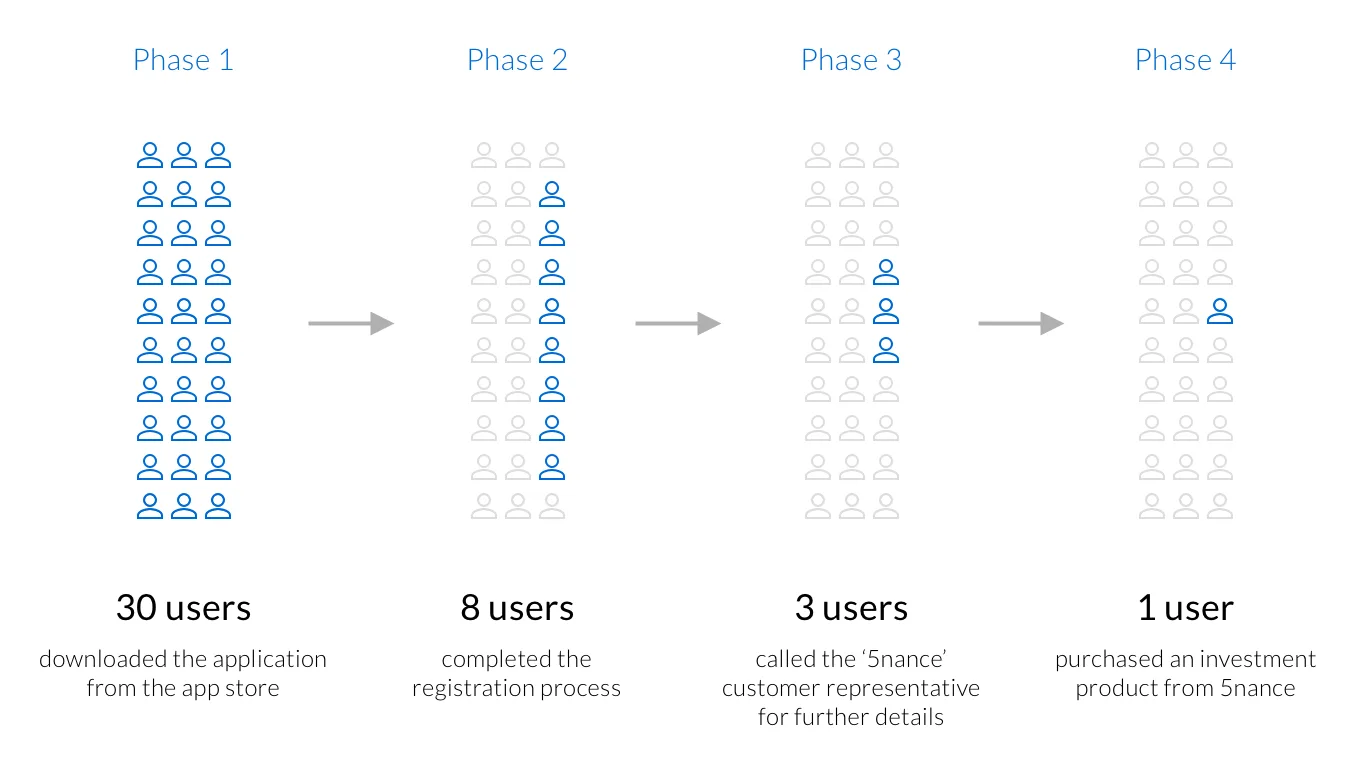
To better understand user drop-offs, I divided the onboarding journey into four primary phases, mirroring the experience journey described above. Out of every 30 users who downloaded the application, only 8 managed to complete the onboarding and registration process.
FITSIP currently lacks a self-checkout feature that enables users to make purchase decisions without agent involvement. Upon proceeding, users are presented with a telephone number for the 5nance sales team, which they need to contact for purchases. Out of the 8 users who completed the registration, only 3 reached out to the sales team for product inquiries. Ultimately, only 1 user successfully completed an investment purchase through 5nance.
Market performance and user's perception
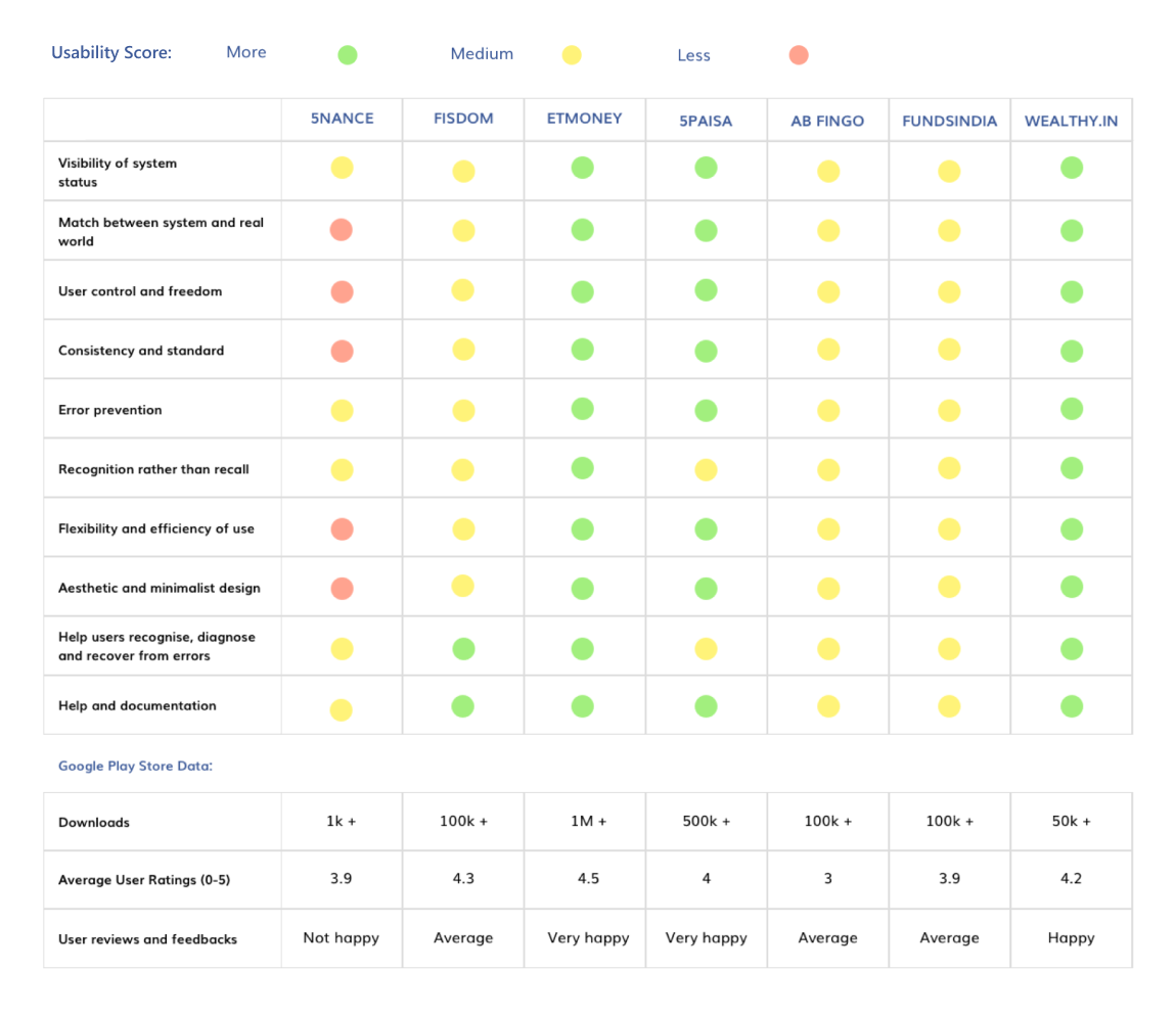
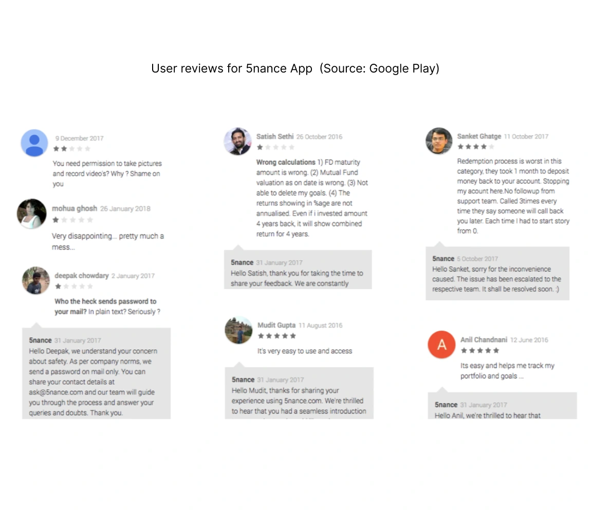
To conduct a comprehensive competitor analysis, we employed the 10 Heuristic Principles of usability. Our evaluation included prominent mobile products in the asset management segment in India (such as Fisdom, ETMoney, 5Paisa,AB Fingo, FundsIndia, Wealthy), along with 5nance.
The objective was to explore the correlation between their usability and users' perception, as evidenced by their reviews. This analysis will shed light on pain points and potential opportunities within our product.
Discovery and planning workshop
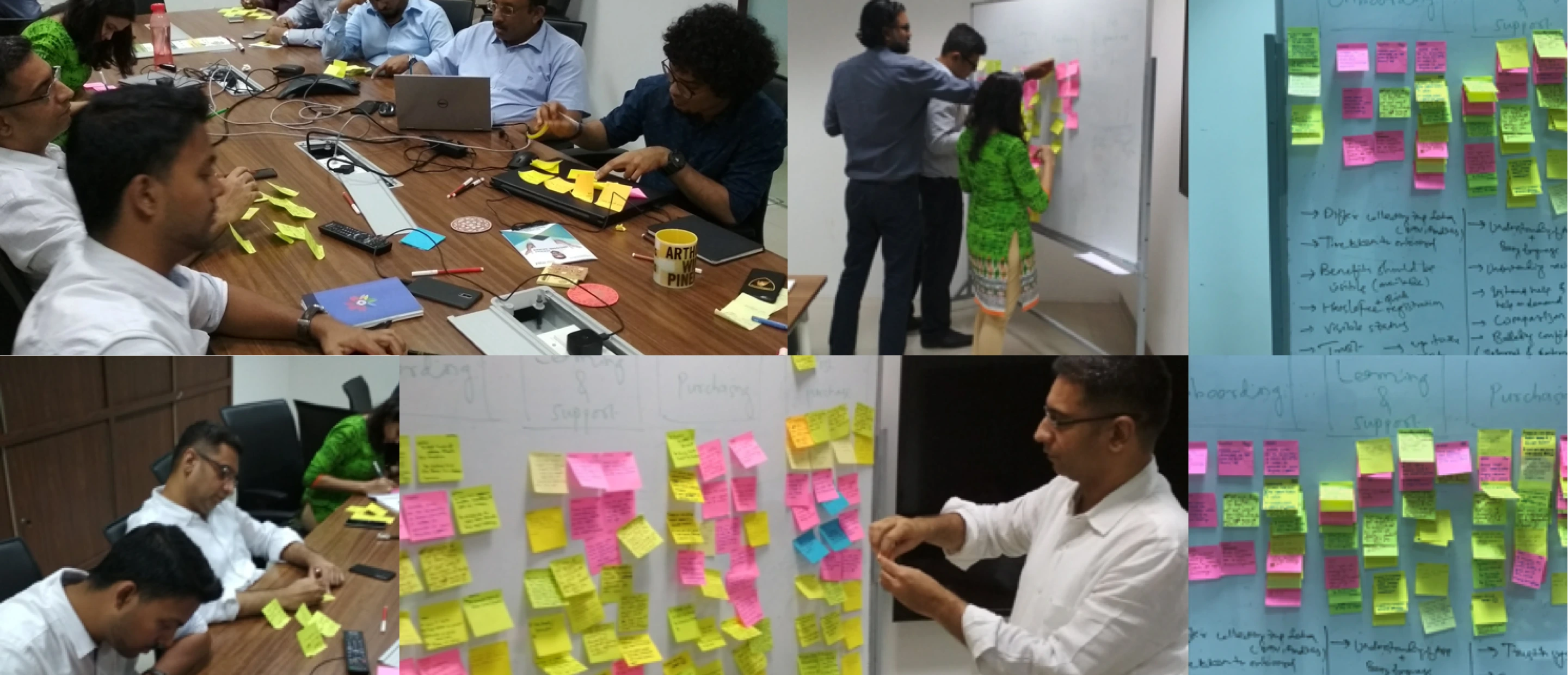
To identify addressable work areas and establish a project plan, we organized an extensive discovery workshop with all stakeholders at the client's office.
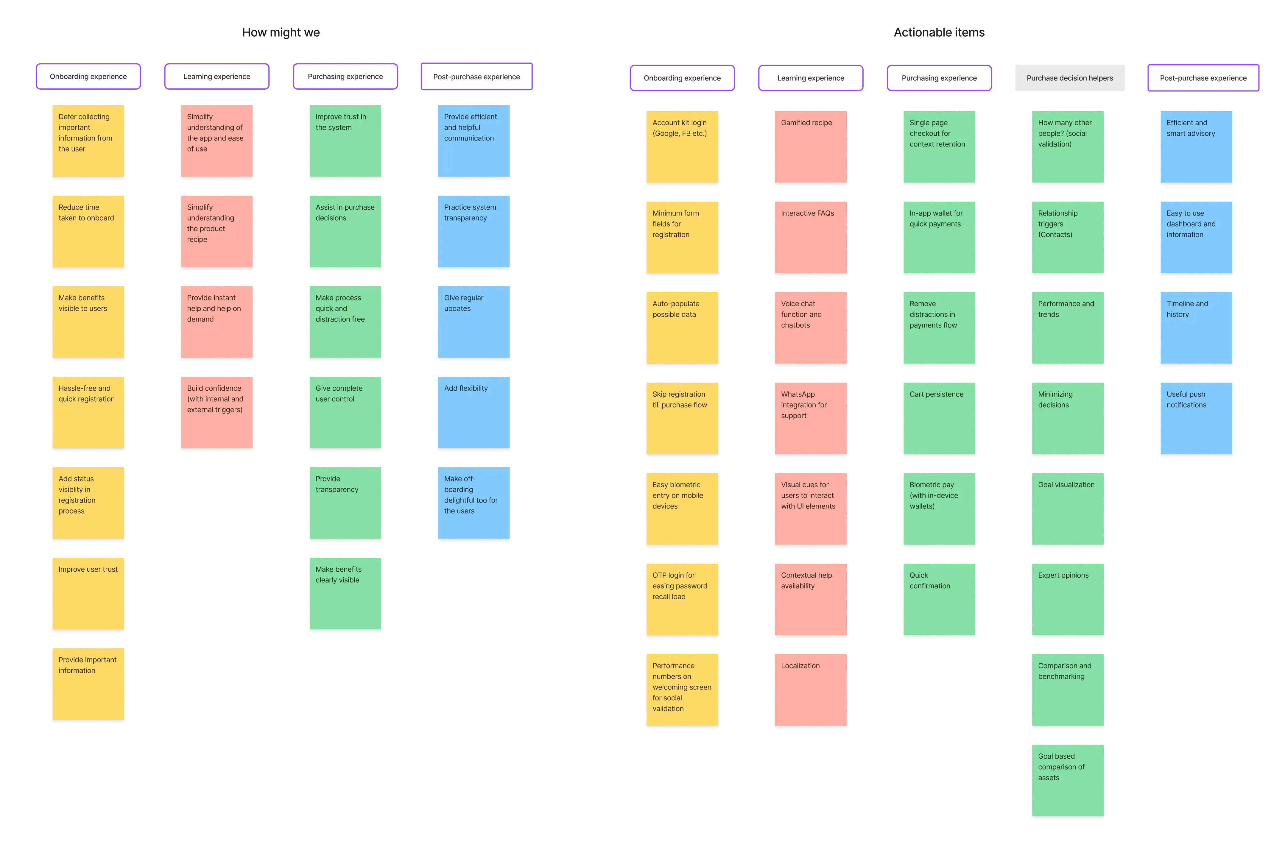
The objective was to comprehensively address the entire discovery and purchase journey for 5nance. During the workshop, we uncovered usability issues within the existing product and generated innovative ideas to address them.
Designing application flow
In the workshop, we established that the overall product experience is a culmination of multiple interconnected flows. This encompasses essential stages such as onboarding, product discovery, purchase, investment setup, post-purchase support, communication, and more.
In this particular case, our objective is to seamlessly integrate learning and support into the overall user experience. We aim to empower users to explore products, complete payments, and trust that they can effortlessly achieve their goals, all while having access to necessary guidance and assistance.
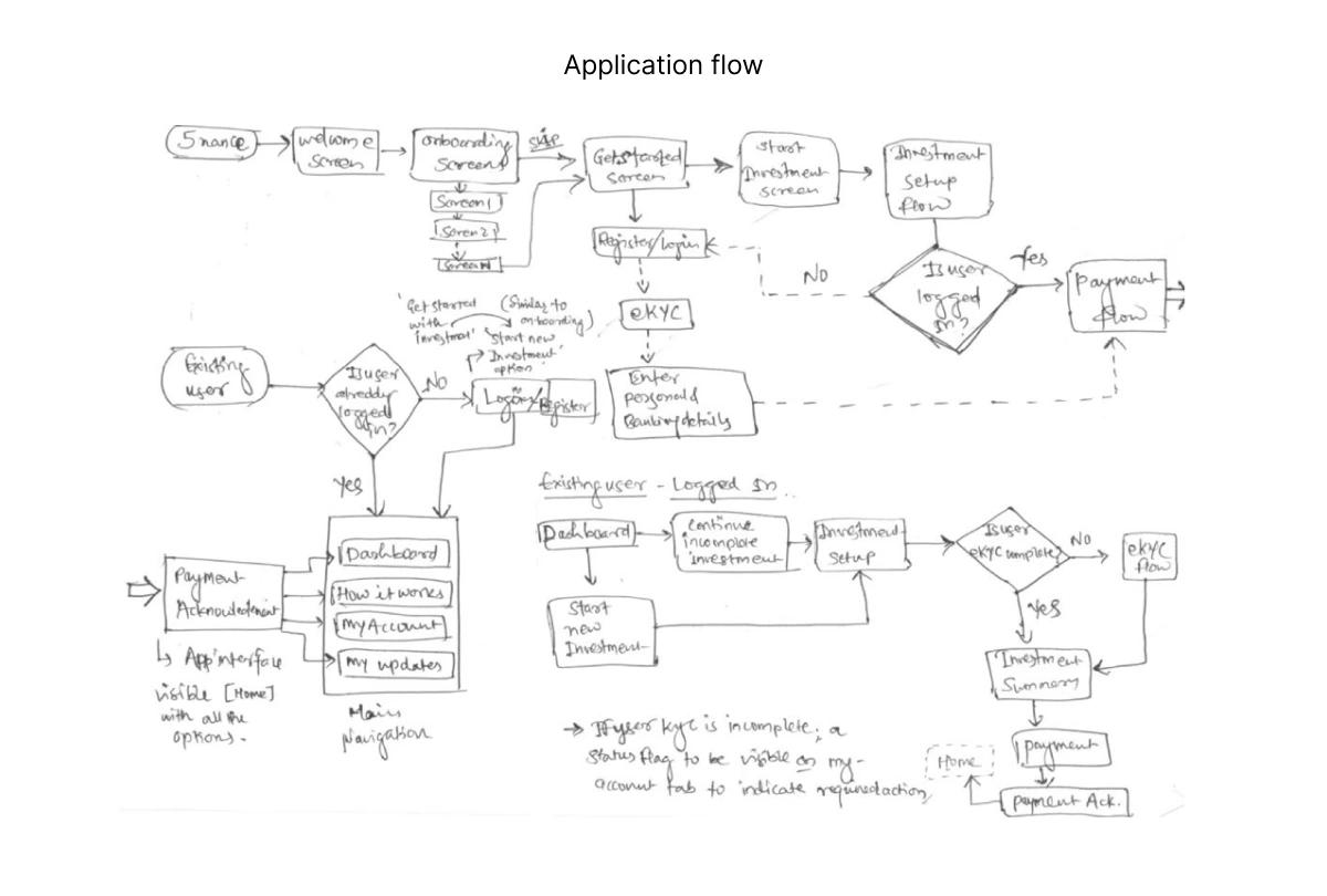

Planning FITSIP dashboard
As a strategic decision, we opted to develop a comprehensive dashboard that serves as the app's landing page, the gateway to various services, and the central hub for users to receive investment updates and make informed decisions.
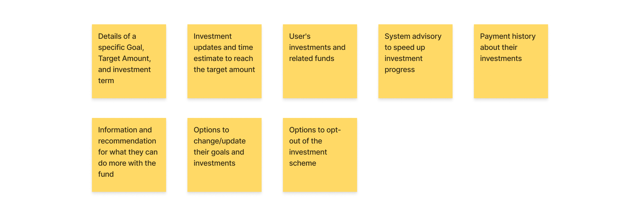
Working with experience elements
To gain insights into information design perceptions, we employed a hybrid card sorting method involving both experienced and novice users of fintech mobile applications. A total of 63 cards were created, encompassing diverse elements ranging from button names to section labels. These elements form the foundation of the information architecture for a mobile finance and investment product.

To facilitate this quick card sorting process, we enlisted the assistance of four users who possessed diverse levels of prior experience with mobile banking and finance products. This approach proved instrumental in comprehending their cognitive processes and envisioning an effective information structure.


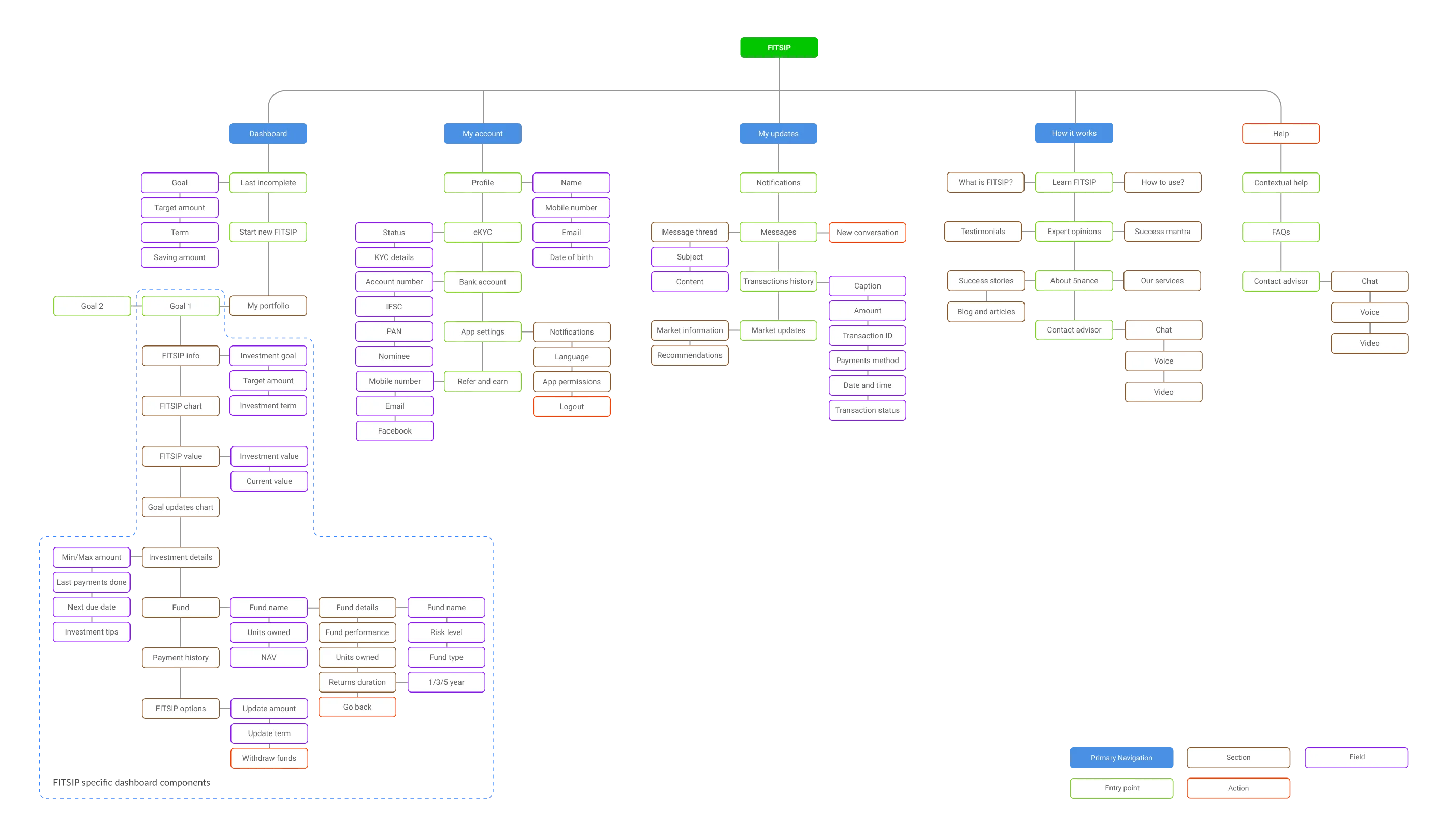
Building information architecture
Once the task flows and content categories were determined, we proceeded to construct the structural framework for various elements and application pages.
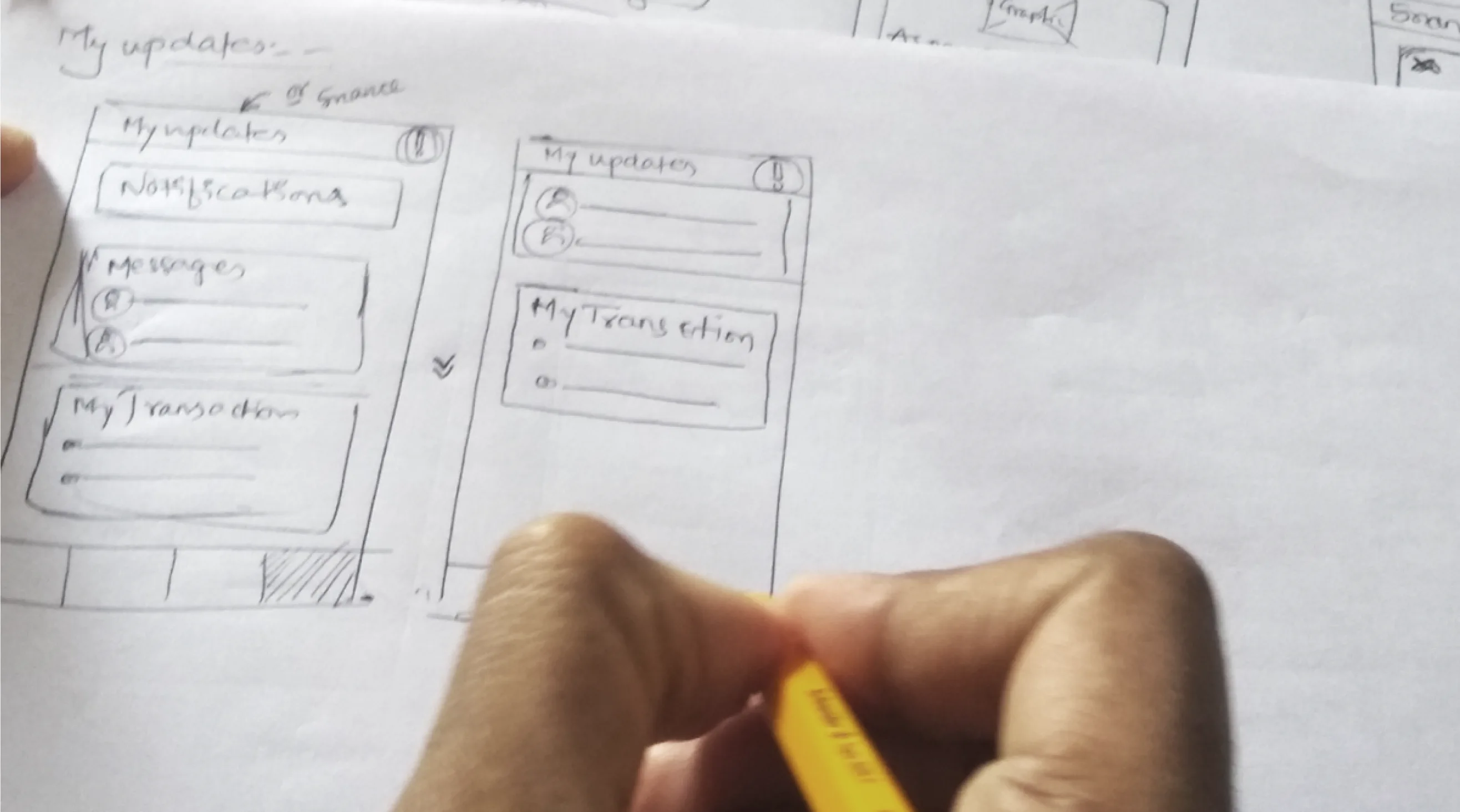
Wireframes
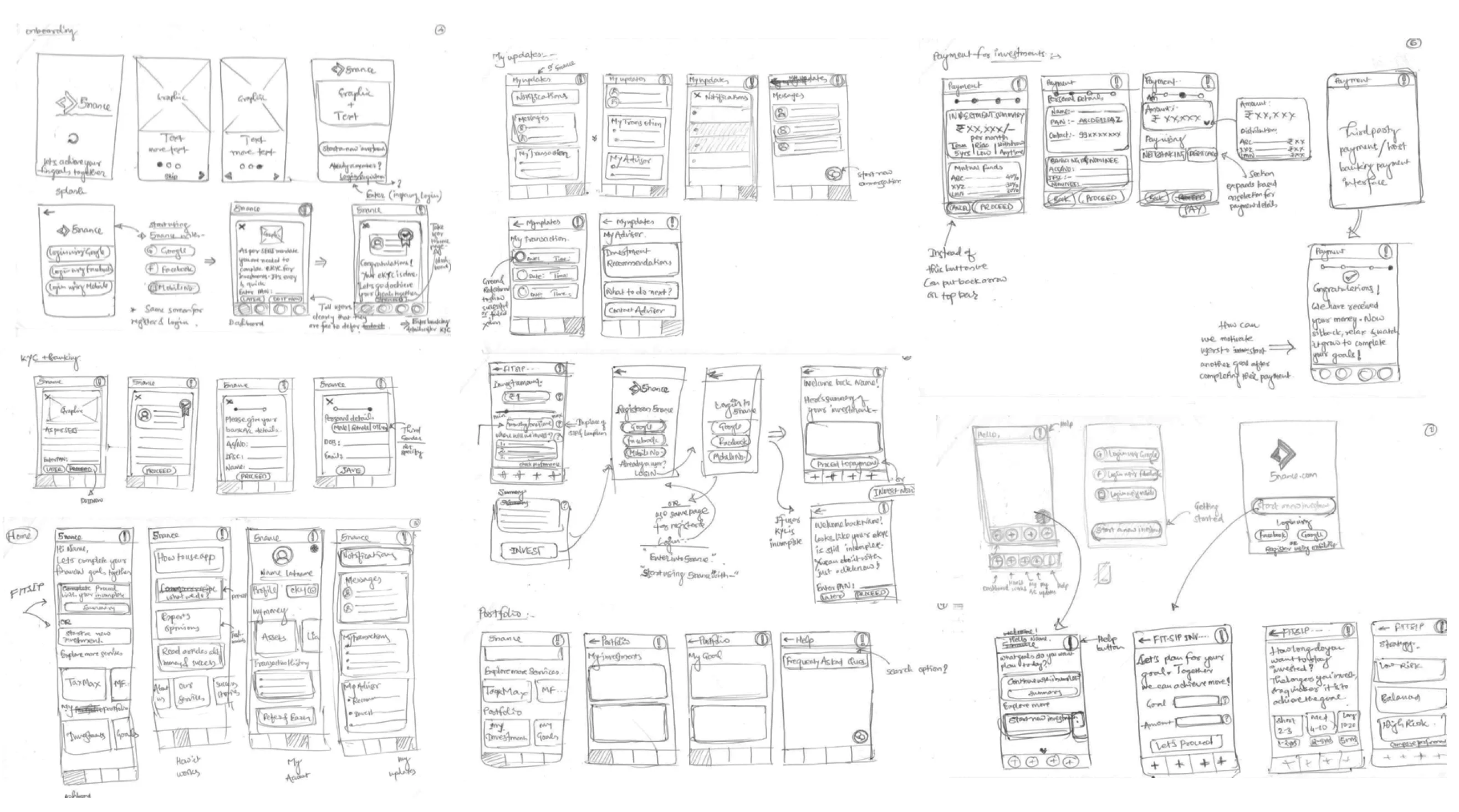
Throughout the design process, we conducted a comprehensive exploration of screen layout and information grouping, carefully considering how elements should be organized and presented to users. To streamline the design process and obtain valuable feedback from clients, our initial focus revolved around creating low-fidelity wireframes.
UI Design
Upon receiving feedback and flow-related suggestions on the wireframes, we proceeded to refine and enhance the user interface (UI) and visual designs to a high-fidelity level.
